
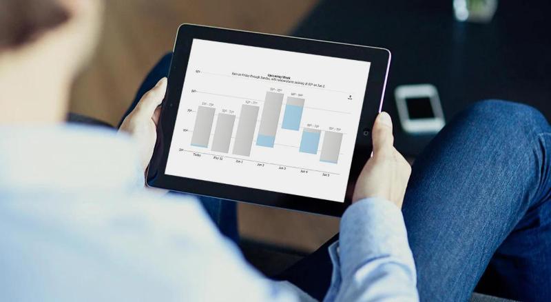
Having quick access to information is something that has become a part of our daily lives, so being able to represent data in the real world in a way that is easy to understand is increasingly important. This is why there is a growing need to understand charts and how data is represented on them. Charts make it easier to present and understand complex data sets; however, because there are so many different types of charts to choose from, it can get a bit confusing understanding which is which and which is best for what.
There are a variety of bar charts (also known as bar graphs) that are available for data representation; however, understanding how they work and how to draw them is something that a lot of us cannot seem to understand. Let’s dive into the world of bar charts to better understand how to use them, how to draw them, and how to interpret them.
Table of Contents
Creating Charts
Today we are blessed with a large number of advanced tools for chart creation. Common desktop applications such as Microsoft Excel have rich chart tools for desktop usage. For online and the web, there are many advanced JavaScript chart libraries that enable you to integrate charts seamlessly into your website. While excel charts can be saved and images and used on the web, they don’t offer interactive features such as tooltips which let you read values, click or drill down into data and zoom cleanly if you need a closer look!
Bar Charts
Let us start with the simple bar chart. A bar chart is a type of graph that is used to show and compare different measures for different categories of data or data series. This chart type can either be in horizontal or in a vertical orientation. In vertical form, it is usually called a column chart while in the horizontal form it is referred to a bar chart. Horizontal bars are typically simply referred to as bars and vertical bars as columns.
Despite the difference in representation, the names of these charts are usually often used interchangeably. Bar and column charts are very commonly used in data representation because they are simple to display data and very easy to interpret. The standard bar chart looks like this:
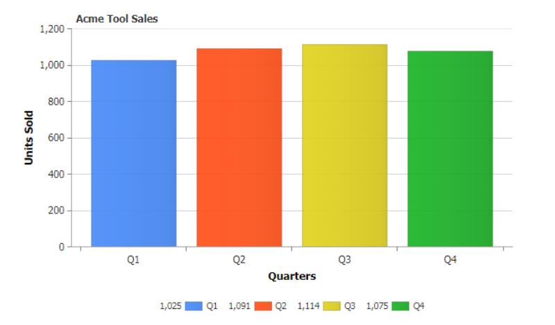
This representation shows the total sales of all products broken down by financial quarter. This type of bar chart is pretty standard and is the most used in easy data representation.
Clustered Bar Charts
A clustered bar chart is similar to a simple bar chart the difference is that this bar chart represents more than one series of data for a given category. Where the simple bar chart represents one piece of data per bar or category (total sales), the clustered bar chart represents a series of data clustered together (one for each product sold).
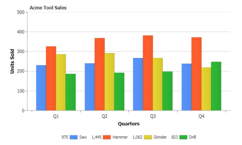
The above graph is a perfect example of the clustered bar chart. It shows the representation of the unit of sales of 4 products in different business quarters. The clustered bar chart can either be a vertical or a horizontal representation, and it is best suited to represent multiple series of data in reports where you wish to compare values within quarters as well as across quarters. Here you can compare the product sales relative to each other in Q1 but also compare how drills sell between Q1 and Q2 for example.
Stacked Bar Chart
The stacked bar chart or stacked column chart is almost like the clustered bar chart except, in this case, the series of data are represented in distinct sections on top of each other as opposed to being side by side in different bars or columns. In the case of a stacked bar or column chart, the data is represented as a whole but, it is sectioned into different categories of the whole data. Stacked bar charts visualize parts of the whole similar to pie charts but are often more legible.
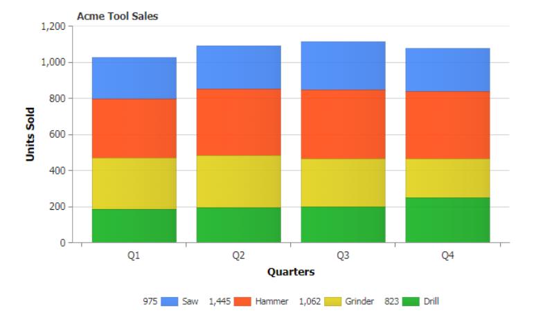
This chart above is a classic stacked bar chart showing the different units of a whole product that has been sold in the different business quarters. This enables easy comparison of total sales by quarter, and still allows relative comparisons of how much each product contributes to these total sales.
Range Bar Charts
This chart is very similar to the simple bar chart; however, in this case, the data being represented are grouped into categories showing their highest and lowest points, respectively. This form of representation tends to make the bars appear to be floating or hovering within their ranges.
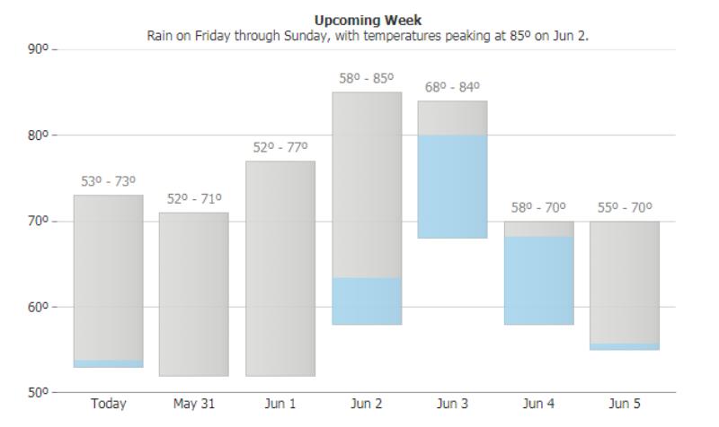
The above diagram shows a range bar chart representing the different temperature ranges predicted for future days as well as the probability of precipitation. The horizontal axis shows days in the future where the vertical axis shows the temperature.
Stacked Pyramid Charts
First of all, pyramid charts are basically normal charts that are shaped like a pyramid for easier understanding and interpretation.
A stacked pyramid chart is a pyramid chart with values stacked on top of each other, usually according to their level on the hierarchy.
A classic example of the stacked pyramid chart is Maslow’s hierarchy of needs. This pyramid hierarchy shows accurately in pyramid form the various levels of human needs according to their level of importance. This type of data representation is best for representing the values rather than the categories of the represented data.
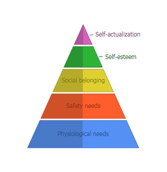
The data represented in a stacked pyramid chart usually shows the level of importance, starting from the bottom to the top. This means that the category represented at the bottom of the pyramid is usually more widely accepted than at the peak, even though the category at the peak is usually the highest level. This can clearly be seen in Maslow’s hierarchy of needs.
Bar Charts vs Column Charts
Bar charts and column charts (also known as vertical bar charts) are basically the same things when it comes to data representation. The only difference is that the bar chart is presented horizontally (with values on the x axis and categories on the y axis) while the column chart is represented vertically (with values on the y axis and categories on the x axis). The difference in the representation of these charts reflects in their uses, and there are areas of data representation where they both trump each other in functionality.
For instance, bar charts are better for representing data with long labels as opposed to column charts. This is because, on a bar chart, there is enough space for each bar to be labelled appropriately on the category axis as opposed to looking jam-packed on a column chart.
Also, when it comes to representing negatives on a chart, it is not as easy to read on a bar chart as the bar chart represents the negative values to the left and the positive values to the right. The representation is far easier to understand on the column chart where the negatives are represented in a downward direction, and the positive values are represented in the upward direction.
Ultimately, the bar and the column chart can be used either way; however, the column chart is better used in the case of making comparisons while the bar charts are better used in cases where the data to be represented are a lot, and the labels are lengthy.
Population Pyramid Bar Charts
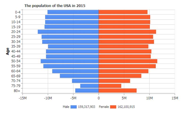
In addition bar charts can be used to compare multiple series together as it commonly used with population pyramids. Here two bar charts are combined so it is easy to view trends
Error Bars on Bar Charts
In a bar chart, error bars are simply representations of the variations in the values that are represented on the chart. This means that the error bars are an indication of either how correct a certain value is, or how far from the real value the reported value is. These errors are represented by the use of a line drawn over the bar representation showing its range and points of data. Error bars are usually used in the representation of standard error, standard deviation, or, confidence intervals; it also represents the highest and lowest value range in the set of data.
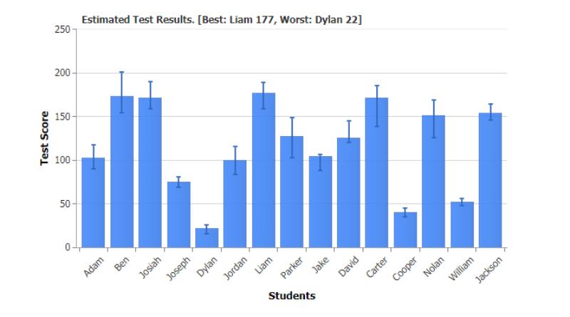
The above graph shows the representation of an error bar. Basically, the longer the error line is, the more the level of uncertainty of the given data point. Error bars are usually used in the graphical representation of scientific or experimental research or papers. In this example, estimated student test result performance is analyzed.
Negative Bar Values
On a bar chart or a column chart, the representation of negative values is referred to as negative bars. This is common in the case of reporting the profits and loss values on a chart. On a bar chart, the negative bar values are usually drawn to the left side of the chart while on a column chart, the negative bar values are drawn facing downwards on the chart. As noted previously in the bar and column comparison, it is easier to read and more intuitive to chart with a column chart when dealing with negative values.
Icons on Bars
In some cases, some representation of data on a chart may not necessarily require the use of labels, rather, the use of icons at the top of the respective bars or columns would be easier to read and identify in terms of labeling.
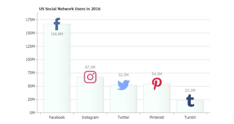
This chart above is a perfect example of icons being used as a form of labeling where popular social media sites and their logos are used to simplify the text loading and provide a cleaner and more accessible chart visualization.
Colour Blind/ Accessibility
When creating a bar chart, it is important to take into consideration the fact that some of the readers may be color blind. As a result of this, it is important to choose colors that are easy to be identified by even people with color deficiencies. This can be done by selecting palettes that are accessible but can also be improved with the use of shading or textures to aid in differentiating the bars or columns as this helps to better distinguish them.
Linear Gauge
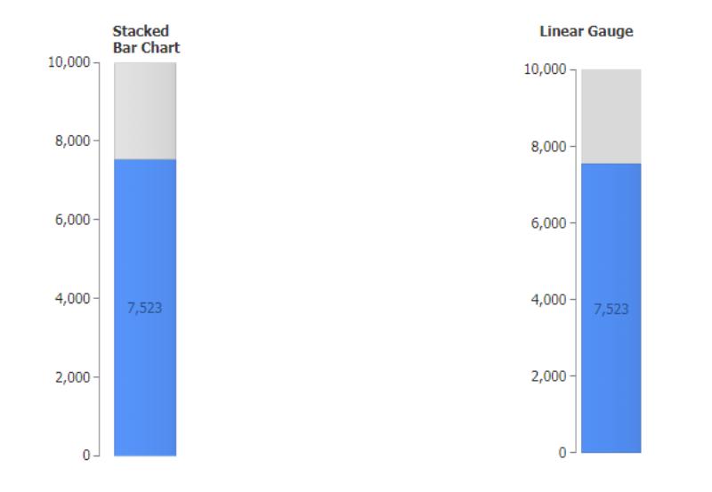
A linear gauge is a form of visual data representation that uses a scale to show the range of data. It can also use a bar with a data pointer to show the value of the data on the scale. Sometimes a linear gauge acts as a simulation like in the case of a thermometer. However, most of the time a linear gauge is very similar to a stacked bar chart with two points. The difference, however, is that in a linear gauge each stacked section has its own range and where one range stops are where the next begins. Linear gauges show a single value where stacked bars compare two values.
Bar and column charts are one of the easiest and most accessible ways to represent your data in a visualized, easy-to-read, and understand format. It is, however, rather confusing with so many bar and column data visualization options knowing what format is best to use for what sort of data representation and this is why it is important to understand how to create, read, interpret and understand the different forms of bar charts as well as their functionalities. From regular bars and columns to clustered and stacked variations, every bar chart is unique in its representation, and the more we understand them, the better we can visualize our data.
This article was originally published on JSCharting.
#AcceptGuestPost
Accept Guest Post


