When starting a website project, you should look for web design mistakes to avoid. That is something that most business owners overlook, but it has the greatest impact on the user experience. Even the most experienced professionals, however, make mistakes.
Making those mistakes means giving your competitors a huge advantage in attracting and serving customers. However, we knew that no business owner or marketer would want that!
If you have trouble with your website, you may have made some of the common mistakes listed below. Let’s get to all those problems and how you might solve them without further ado!
Table of Contents
Here are the following 9 biggest web design and Development Mistakes You Can Easily Avoid:
1. A Slowly Loading Website:
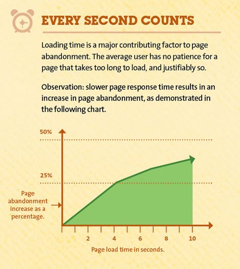
We have already discussed the significance of web design in terms of site speed. While having a lot of fancy JavaScript animations, the latest technology, and gimmicks on your site can be nice, it will not do you much good if it comes at the expense of performance. In that case, many people may not even see your Milwaukee web design because they will not wait for it to finish loading.
2. A lack of clarity Call to action:
Your website is designed with one overarching goal: to generate conversions of any kind you choose. If your traffic is heading in the right direction and your stats are looking good, there is only one problem: your low conversion rate. In most cases, you may have a lick of a clear call to action to achieve your goals. You are not communicating properly with users because of this issue. They are curious about your products or services, but you are still one step away from convincing them. However, you will not have to worry about this issue because solving it is as simple as eating pie.
3. The best web design mistake to avoid are unclear brand messaging:
We have already stated that unclear brand messaging is the most serious Milwaukee web design mistake to avoid. The brand message is the most visible way to distinguish yourself from hundreds, if not thousands, of competitors in the market. It is what all the giants do, and you should also pay attention to it. Uncertain brand messaging will do more harm than you realize. Visitors will leave if they cannot figure out who you are or why they must trust you. Worse, they will doubt or forget about you. Strong branding and an effective communication strategy will allow you to be recognized anywhere.
4. First impressions are important:
Remember how they say you never get a second chance to make a good first impression? That sentiment also applies to websites. Visitors make quick decisions about whether or not to stay on your website. As a result, you want to make your first impression as positive and distinct as possible. Anyone who visits your website should quickly understand what it is about and what they can do there. Otherwise, your visitors will leave faster than you can google “high bounce rate effect on search rankings” (hint: it is not good).
5. Search Engine Optimization Flaws (SEO):
If you think avoiding web design mistakes is bad enough, web development could be even worse. Weak Search Engine Optimization (SEO) is the fastest way to lose traffic and efforts. Good content can automatically generate users, while bad content can drive them away. If you have not been paying attention to your SEO results, take this as a warning.
Since 2011, SoftCircles has been one of Milwaukee’s leading web design firms. They focus on creating professional and customized user experiences where imagination meets creativity and technology through their strategic and meticulous website design services. They hire certified developers, digital marketers, and innovators with deep domain knowledge, technology, and design abilities.
6. Font, color, graphics, and other design issues:
While we are still delving into web design blunders to avoid, why not discuss design issues? You may wonder what could go mistaken with a design, but let us assure you that there are numerous possibilities.
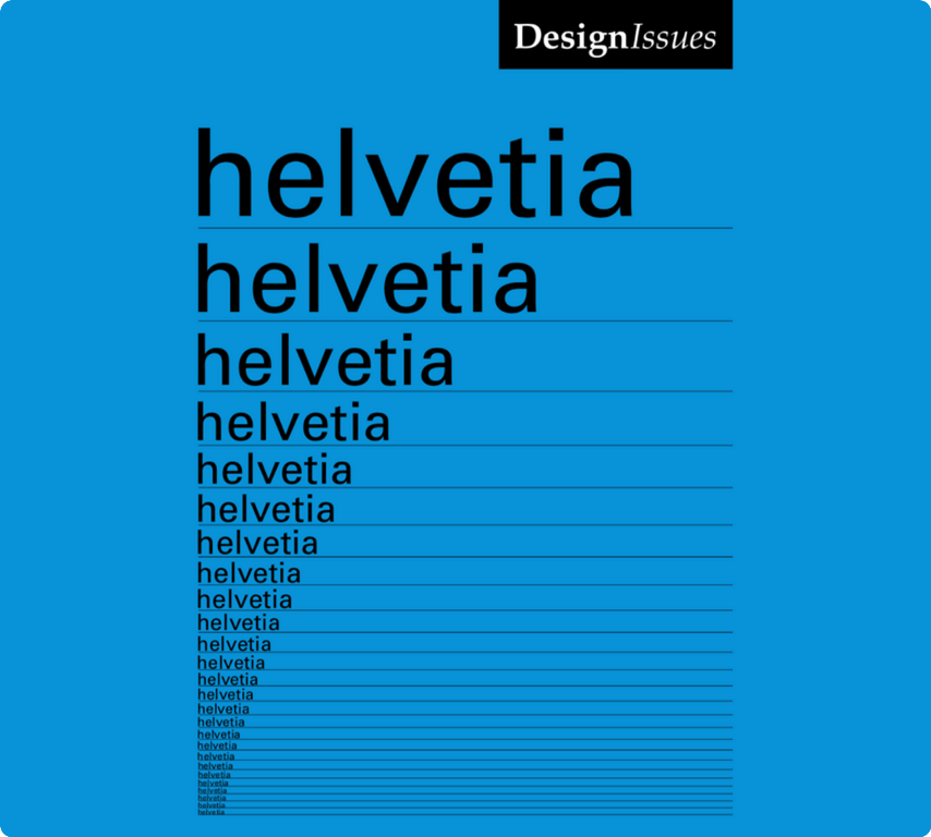
The first issue is with fonts! Too small, too large, too overwhelming, or too difficult to read. Keep your fonts simple and neat, and do not use more than three, especially on your homepage. Choose wisely and try to keep your font consistent. Do not forget to maximize readability by using the appropriate font size: large enough to read but small enough to keep things neat.
7. Large, uninterrupted blocks of text:
Most visitors today want to quickly scan content to get an overview and decide whether to read it in its entirety. Having one large chunk of text will make that difficult. Websites are not books and thus should not have the same layout. It is difficult to read, provides no rest for the eyes, and immediately makes your site low-quality. Even if the information you provide is worth gold, most visitors will not bother to find out.
8. Contact information is difficult to locate:
Another common web design blunder to avoid! Your company should be easy to find, if not with a single click. Users want and need to know how to contact you when they need to. Add a Contact page to your navigation bar. That is where you provide everything you have, from your email, phone, and hotline to your address and a map to get there. You can also make an instant call button that they can reach anytime. Some websites even include plugins that enable them to chat with visitors in real-time. You will not have to be creative with contact information. You need to make it all visible and accessible.
9. Sharing Options Are Missing:
Social media networks have evolved into alternative search engines capable of attracting thousands of visitors. However, only if your content is shared on there. What would make that process go more smoothly? Of course, sharing options are available.
While some people will have trouble manually copying and pasting your site link into their favorite social network, most prefer a simple button click. Failure to provide that option is a flaw in your Milwaukee website design.
Conclusion:
A good web design is one of the most important factors in the success of any website. It is the first thing visitors notice and is in charge of establishing trust, providing direction, and increasing usability.
It also implies that poor web design can make your site unappealing and difficult to use. It is a difficult balancing act to master between aesthetics and functionality. Reviewing the web design mistakes listed above can avoid some of the most obvious blunders. Simultaneously, do not forget to experiment because that is half the fun.


