
Design by Edison Wong 7
What is your first memory of the World Wide Web? Let’s look far back in the past. Tik-toсk, look at the swinging watch. Your eyes are closing, and you’re starting to see the hottest design trends penetrating the web in the ’90s.
Sans fonts, hit counters, animated GIFs, and comic details saturated websites at that time. The Earth has turned around the sun many times since then. Things changed quite a bit, and web design is not an exception.
However, a forgotten fashion tends to come back. Looking back to the future, we’re going to outline the top 5 most memorable old-school trends that are heading the web design today.
Table of Contents
1. “Coming Soon” Page
The website visitor enters a website and sees that it’s under construction. But what does he or she see there? Not the empty page.
“Under Construction” or “Coming Soon” web page is one of the old-fashion trends that are commonly used today. Usually, we notify the public that a website is under construction at the moment to motivate them to come back again in the future. That grants the chance not to lose the web visitors who can become your prospective leads.

“Coming Soon” page by WordPress
Scenario 1. Imagine, people enter an “Under Construction” web page and see the lazily designed graphics or merely a phrase “the website is coming soon.” Looks too boring to be memorable.
Today’s website visitors are too overwhelmed with information to remember this phrase as well as the fact that your website is temporarily under construction. They will never come back having forgotten your company.
Scenario 2. People have no idea about your company. Surfing on the web, they randomly choose your company website among dozens of other search results. They enter it and see a remarkable, bold, and refined “Coming Soon” webpage design. The incredible example of the interactive “Coming Soon” page is the interactive comic web design for SketchyBones.
We, humans, love mystery. Creating an intriguing “Coming Soon web page design you can make people wanna come back again to see the continuation of this story or, in other words, your upgraded website. The “Coming Soon” page is particularly worthy of investments.
2. Cinematic Retro Fonts
Let’s look back in the font’s evolution history. Imagine, you’re a hero of the 1950s. Switch on the TV. What do you see there? Likely, you see a black & white movie or cartoon and… the variety of beautiful cinematic retro fonts used in the movie title or titers.
Retro fonts can evoke a pleasant feeling of nostalgia, create a comic effect, or make the design look bold and even “dangerous.” Mostly, such fonts are comparatively easy to create. They are simple but powerful if you use them in the right place. Usually, these fonts need more “white space” around; they catch an eye and user’s attention. Keep in mind that simple rule of the white space”, it’s especially crucial for big retro fonts. Don’t let these fonts lose their magnetism by not leaving enough room around them.
Nowadays, many companies use bold retro fonts in their branding or marketing visuals. Below, you can see two examples of incredible font design created by two sports goods giants, Nike and Puma.
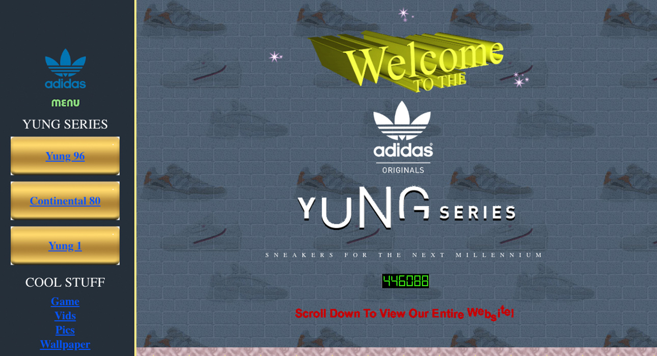
Adidas Yung Series web page by Mediamonks
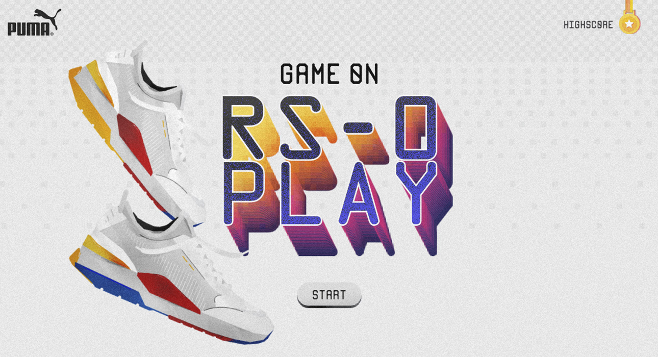
Puma RS-0 Play web design by Superhero Cheesecake
3. Pixel Fashion
It’s the time of the buttonless screens and high-resolution images. Many of us may admit we miss and still love pixel fashion. We remember the time when we’re the hooligans playing Tetris and video-games instead of going to school.
Pixel elements taste as a cute passed away fashion, which is now coming back. Rethought pixel design is gaining its momentum today. There are even brands whose main product concepts are based on a pixel design. For example, LaMetric has created a stylish smart clock with a pixel screen that has become a hit for many tech geeks and tech influencers today. Pixel screen is what distinguishes LaMetric TIME design among the crowd of other smart electronics brands.
Another excellent example of pixel fashion in product design is a pixel backpack designed by Pix Backpack. Those beautiful and glimmering pixels can display any of the old-school pictures and animations right on your backpack.
Sorry for my passion for pixel design products. Let’s come back into web design. Rethought pixel elements have become great decorations for modern web designs too. The ability to combine the past and current fashion is a real art that can make your website design eye-catching and memorable.
Below you can see a prominent example of pixel art in Timesheet Magazine London web design. Slightly visible pixels significantly add the hue of old-school style into this design.
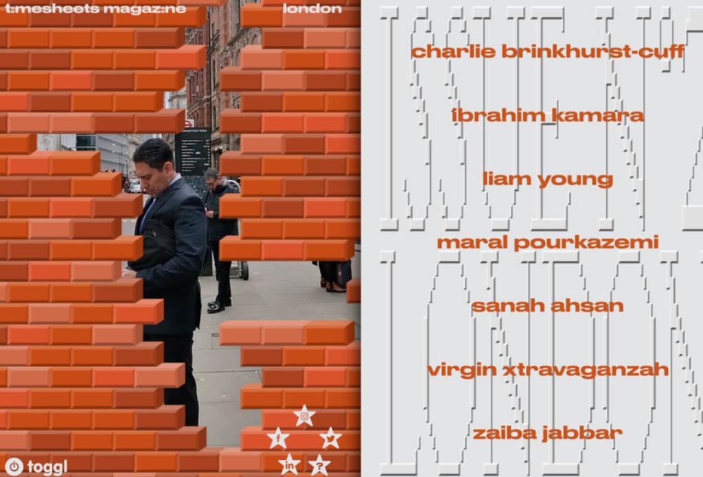
Pixel website design for Timesheet Magazine London
4. Throwback Color Aesthetics
There is no old, it’s only new again. Web design is tending to bring back some old-fashion elements that add the slight feeling of nostalgia into the aesthetics. One of them is a retro color scheme.
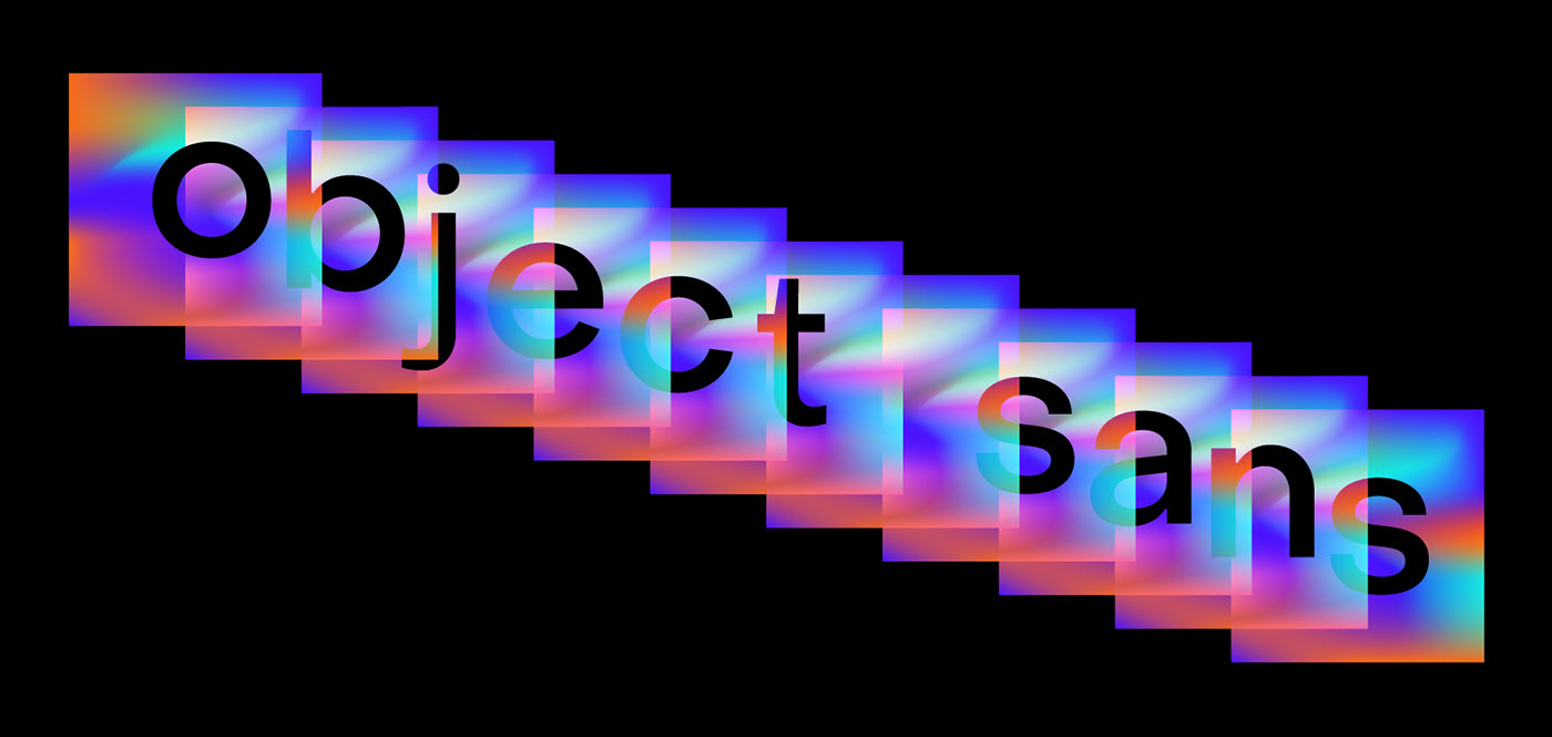
Geometric Font Family designed by Alex Slobzheninov
The color is the first thing we subconsciously perceive when interacting with a certain design. Muted or pastel colors, illogical combinations of the most uncombining colors, gradients – these are just a few of the retro-elements in color aesthetics that are coming back into the web design fashion today. By using these retro-color hints in your website design, you can model the magnificent feeling of the juxtaposition between the past and today what can make your design even more magnetic and memorable.
Below, you can see the nice example of the muted retro-color scheme used in the website template design created by Nice, Very Nice design studio. Muted yellow, blue, and retro-pink are perfectly blended into the color nostalgia cocktail in this website design.
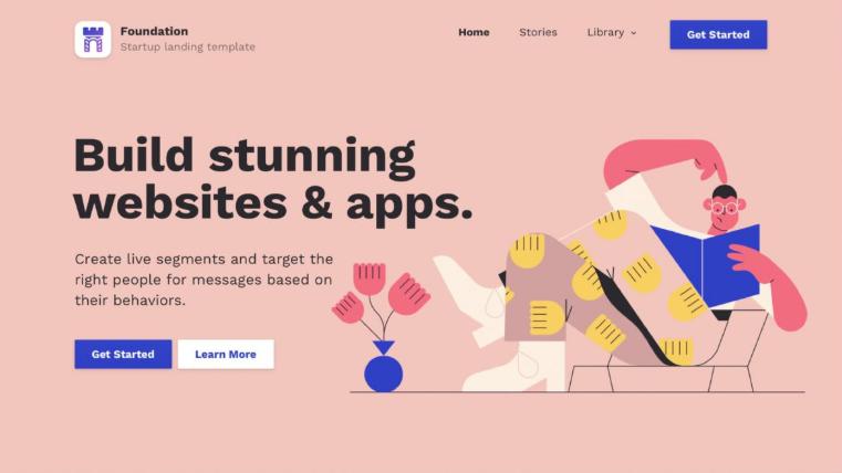
Retro-colored website design by Nice, Very Nice
5. Hit Counters
“You’re a lucky visitor number 10,000”. Do you remember that cute and old-school phrase under a hit counter on the website? That element lost its marketing power because such a number of web visitors doesn’t influence people much today. However, it gained new meaning in web design.
Such a lovely retro-element takes us back into the pleasant past and makes many people subtly smile. Some of them associate themselves with the time when they’re young and happy geeks. Hit counters can even evoke somebody’s memories about the cheap sweets or cola.
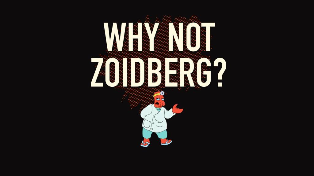
Anyway, this cute web element provokes positive emotions. So, why not to add a pinch of humor to make the overall web user experience more remarkable? Why not, Zoidberg?
Why Old-School Is Cool?
First, old-school is cool because it evokes pleasant memories of the cheap crips, cola, and cinema tickets. Joking. Old-school web design trends help designers shape a juxtaposition between the past and today, add a hint of humor, boldness, and taste of nostalgia to their designs.
Combining the latest trends and the old-school fashion you can create the whole world of the most unexpected design paradoxes that will make your website truly eye-catching and memorable. Hopefully, the above-mentioned retro web design trends will help you create unforgettable web design magic.
Author’s Bio:

Dana is a text-based adventure connoisseur, a lover of horror movies, and an enthusiastic writer. Working previously with the companies in different industries including mobile app development, VR/AR development, Internet of Things, and design, she loves to write articles on the related topics and share her insights.


